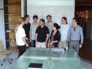
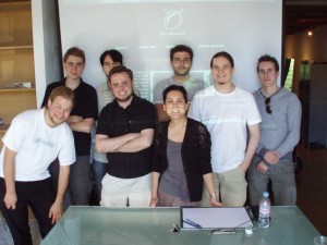
Today, each artist of the project presented a couple of clips or graphics, and talked about style or visual impact as examples for us to look at. You can see this as an extension of the moodboard.
Soenke:

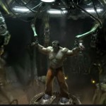
Gametrailer link to Starcraft
I like this clip because it is epic and you can study things like lighting, texturing, compositing, smoke and a lot more.
For example the texturing is very strong in this clip and you can very well see how the textures fit onto the different objects and how they react to the topology.
Nathan:

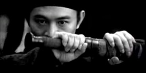
Hero:
The way they use landscapes and environments lends the movie a sense of scale and weight. Also, they make great use of visual symbolism,
especially with color. And of course there’s great martial arts.
Doll Face:
Nothing at all to do with the genre or style of Durian, but I like the simplicity and poetry of the story. If we can give Durian’s story some real poetry and soul, I’ll be very happy.
Starcraft 2 trailer:
The pacing of this trailer is fantastic: a slow, weighty beginning (a calm before the storm/building up tension) followed by kick-ass action. Without the silence before, the action wouldn’t seem nearly as significant.
Ben:

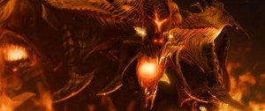
Gametrailer.com Diablo
As this clip is a game trailer, there is not as much to take from it regarding story telling because it is only selling a much larger story. Most of what I studied it for is the overall mood of the world (visual style, locations, inhabitants and so on) and the editing and shot choice.
The fact they can convey so much of an epic world in under two minutes of visuals was fantastic. Breaking it into thirds, the first scene is the very humble act of lighting a candle, followed by a much larger scale of decimated environments (without action) and only the final third contains the evil action. Deciding to allocate the pace that way even with the short timeframe was the main aspect I took from the piece.
David:

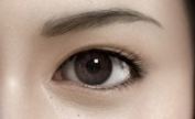
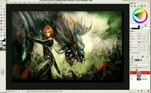
I presented to the team some pictures like this portrait from Kim Jong-Sook , that have a “final fantasy” like proportion of face but with a particular work on the skin material and shading. Interresting in my opinion as we plan to render 4K.
Lee:

Final Fantasy XIII (Versus)
Cinematography, the way they build up anticipation to a climax, its not as much fighting as your mind thinks at the end, easier for artists,
makes climax more satisfying with a build up.
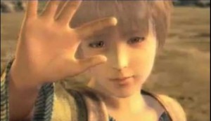
Final Fantasy XI Opening
The emotion between sister saving brother, shows a simple story, but brings up emotion and keeps the audience interested and connected. The
boy at the start pinching over the building with his hand, and again to show its the same person grown up at the end, gives full circle to this
part of the story, and as a comedian does a joke and refers to it soon after, the audience feel they are ‘inside’ and know the character more
in such a short time.
Angela:

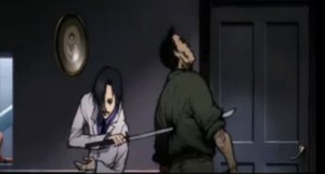
The clip I chose is taken from the movie “Kill Bill – Volume I” (begins at 3:30 – “The Origin of O-Ren”). I chose it for 2 main reasons:
1- To raise discussion on how blood/gore may or may not be used in project Durian
2- To discuss the element of character development/motivation
Although this film is live-action, the flashback is described in dark and gritty 2-D anime style. It gives us a stylized glimpse into this characters head, illustrating why she is the way she is, does the things she does. Elements such as music, pace, camera direction, and even the use of blood effectively work together to fit its specific purpose.
Colin:

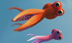
I decided to talk about the short film Oktapodi, an extremely successful animated short from a bunch of students from Gobelins. If you haven’t seen it, it’s well worth the watch! http://www.oktapodi.com/
Although project Durian will have a completely different visual style and tone, I think we have a lot to gain from breaking down great animation (and film) of all types. Oktapodi is a really a nearly-flawless animation in my opinion. It tells a simple yet compelling story in an extremely succinct way. They make it look easy. But there were a lot of decisions about pacing and shot design and visual style that just seem extremely carefully considered. The staging, lighting, designs, music… everything just seems to come seamlessly together. I tend to focus more on shot design and editing, and these elements are what really make this film stand out in my mind. There are just a lot of great shots, and they do a lot to make the sequences dynamic.
To illustrate just one little detail I liked about the shot design, let’s break down the first two shots of the movie. First of all, the entire premise of the movie is set up in the first two shots. In less than 20 seconds into the film, we understand the entire conflict and thrust of the plot. But the spatial relationships between the two shots are what really interest me. The first shot ends with the male octopus looking outside the tank, and we CUT to a reverse shot of what essentially is his point of view. The girl octopus looks helplessly towards the camera as she is weighed and thrown into a cooler… but then the human character removes the cooler from the frame and reveals our main character in the background! What is understood as a point of view shot becomes a wide-angle of the male octopus. This is just an example of extremely clever shot design which I think is a big part of making this film so entertaining to watch.
I’m looking forward to experimenting with shot design for Durian to find the most effective way to tell our story!


