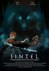
If you have a movie, it ought to have a Poster!
on September 22nd, 2010, by Pablo VazquezWe can haz poster? yes we can haz!
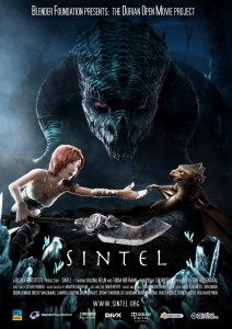
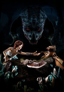
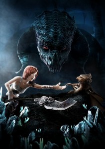
Ton, Soenke and I just came back from checking a proof print of the poster, and it looks marvelous!, bright, great contrast, nice subtle colors, not extremely saturated, right like on the screen.
The process of making this poster started months ago with some ideas David had, then we had this task of getting the actual movie done and forgot about the poster, so the actual work started last week.
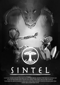
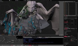
Concept by David, characters posed by Lee, lighting/render by me, and amazing paint over by David! 😀
Keep reading to know more about the making of!
Poster process
Want one? 😀
Want an original 70 x 100 cm Sintel poster in high quality?, there will be a few on sale at the Blender Conference 2010, grab yours!, if you want to print them by yourself, the hi-res (6k) image will be available on the DVD. 🙂
Hasta luego! (now you know how to wave good bye in Spanish!)
Pablo



September 22nd, 2010 at 4:17 pm
first!!!!
September 22nd, 2010 at 4:24 pm
second!!! 🙂
September 22nd, 2010 at 4:29 pm
may be third
September 22nd, 2010 at 4:30 pm
man alive! what’s this obsession with being either first or second to comment.
On topic though! This is awesome! I’ve now wallpapered this to my desktop. 🙂
September 22nd, 2010 at 4:32 pm
I have a handful of critiques in mind, but hell, it’s not worth writing it here! 😀
Congratulations, guys. Really love the making-of look at the poster!
September 22nd, 2010 at 4:35 pm
Congratulations!!! It’s really amazing!!!
September 22nd, 2010 at 4:37 pm
original 70 x 100 mm???
maybe cm? i mean 7×10 cm is tiny tiny for one poster 😀
September 22nd, 2010 at 4:39 pm
@ GrizzLy: ouch! hah missed that one, dank je wel! (now you know how to thank in dutch 😀 )
September 22nd, 2010 at 4:44 pm
55555555
5
5
5
55555
55
55
55
555
55555
Days of unpatience!
Oh please, let the time go faster…
September 22nd, 2010 at 4:49 pm
This is awesome. Huge dragon looks scary.
September 22nd, 2010 at 5:00 pm
And I thought MY lighting setups were insane…
It’s definitely one of the epic ones.
September 22nd, 2010 at 5:06 pm
this is awesome. I like the GIF.
September 22nd, 2010 at 5:09 pm
I think it looks MMAARRVVEELLLIIOOUUUSSS!!!!!!!!!!!!!
September 22nd, 2010 at 5:12 pm
13th yayyy
gotta love the idea though.
http://toplinestory.com/wp-content/uploads/2010/01/sistine-chapel-ceiling-creationofadam.jpg
September 22nd, 2010 at 5:27 pm
the poster looks truly amazing and out of all the different design ideas, i think you chose the right one..
September 22nd, 2010 at 5:40 pm
super
super
super
super
super
September 22nd, 2010 at 5:47 pm
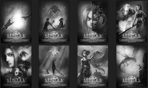
wow this looks amazing!! though I would like to see how the 6th concept would have worked out 😛
September 22nd, 2010 at 5:49 pm
Will we get it without the text on DVD?
September 22nd, 2010 at 5:54 pm
Andreas: of course. 🙂
September 22nd, 2010 at 5:55 pm
@ Andreas Galster: yes, in all its 6k glory, with and without text will be released as CC BY on the DVD (of course without the copyrighted logos).
September 22nd, 2010 at 5:57 pm
It is great! Really Epic!
I have just one little comment: Sintel’s weapon compete a bit too much with the logo…but that’s me just being picky!
Congratulations everyone.
-Gian
September 22nd, 2010 at 6:06 pm
My wife thinks that my attraction to Sintel is unhealthy !80
Great work as always. I was amazed to see all the lights used in just this one shot! (note to self, more lights == more better??)
September 22nd, 2010 at 6:07 pm
It is perfect! Classic triangle composition and well put!
September 22nd, 2010 at 6:13 pm
@Lyle Wlsh,
In my humble opinion, it would depend on the effect you were going for, but generally no, at least not usually to Pablo’s extent here.
September 22nd, 2010 at 6:27 pm
@ Lyle Walsh: not at all! this was a special setup, for example take a look at this image:
/wp-content/uploads/2010/09/sintel_cover.jpg
The image above was lit with 4 lamps (not taking the hair and eye highlights into account, they have their own lights).
The fact that is an “outdoor” shot made it simpler, also has a more natural look on it, that’s easier to light and with only 3 lamps you could make it (used 4 because of lazyness and time constraints).
The poster image has this amount of lights because each character is lit separately (each in its own layer), I didn’t wanted shadows to mess the lighting on the characters. The crystals on the foreground also have special lights.
Most of the lights there are to have nice rim-light everywhere, individually on each character.
So, more lights == more messy and complicated to play with, but you can get nice effects such as extreme rim light, highlight the eyes separately,and also worth to say that not all the lamps are the same!, most of them are non specular, and some of them are only specular, to have nice reflection lights in specific places.
Cheers!
September 22nd, 2010 at 6:38 pm
That’s… awesome.
Thanks for including the making of!
September 22nd, 2010 at 6:43 pm
Great poster, can’t wait to see the print Monday 27th!
September 22nd, 2010 at 6:46 pm
@ J. the comment did :P, sorry for the edit, thanks! 😀
September 22nd, 2010 at 6:53 pm
The other way around? 😛
September 22nd, 2010 at 7:08 pm
amazing…. i will print one the biggest i can
September 22nd, 2010 at 8:10 pm
I am sorry guys – I have to be honest here, even if it’s against the hardwork of so many talented people. But when I look at the poster, I couldn’t even say Wow. The lighting seems blown out, the render doesn’t look good. Maybe I am the only one feeling this way. But that’s why I feel when I first saw it – and I also look at it many time over.
September 22nd, 2010 at 8:19 pm
Wow totally awesome! Is it just me or does the big dragon kinda looks like the bunny from Donnie Darko?!
P.S. Don’t be such a hater young_voter!
September 22nd, 2010 at 8:38 pm
I’m a little sad to agree with young_voter, it’s ok for a movie poster, but I expected a little more from the sintel team.
The renders look a little to soft for me, like there is a blur on everything, it’s missing that sharpness to the renders like I see in the magazine cover.
Also not really impressed with sintel’s face, something seems a little off. little dragon seems ok, but a little oddly lighted, and again seems blurred, or soft.
The text seems really soft..
Not really impressed.. 🙁
But I wont let this put me off the movie, still VERY excited for it! 🙂
September 22nd, 2010 at 8:44 pm
Wow, that’s all I can say. I think it looks incredible! I love the colors, the composition and the lighting. I think it really sets a good tone for the movie.
I agree with Jpmon1, although I think “troll” is a better word than “hater”. I’ve looked at it many times over and don’t really see the point that young_voter is trying to make. I’m also a believer that you shouldn’t make a criticism, if you don’t have a resolution.
September 22nd, 2010 at 8:49 pm
Hi young_voter,
Is not about the scene, but the way you make movie posters.
http://entertainmentondvd.blogspot.com/2008/03/new-iron-man-movie-posters.html
Sintel and Scale are not from Dragon scene (even if they are). It should look like a collage.
Vasi
September 22nd, 2010 at 9:05 pm
I have to keep my mouth shut, but the poster completely makes sense, including lighting.
September 22nd, 2010 at 10:21 pm
Absolutely beautiful. I may be wrong, but I think this may the the first time we’ve seen a render of the adult dragon, and it looks INCREDIBLE.
Gettin’ stoked.
September 22nd, 2010 at 11:28 pm
I want to take this poster home to meet my parents and have babies with it.
’nuff said 😀
September 22nd, 2010 at 11:44 pm
Have you guys thought of selling these in your store? I would really like one but won’t be able to make it to the Blender Conference.
September 23rd, 2010 at 1:33 am
Es agradable saber que personas de habla hispana como pablo esten trabajando en un proyecto tan maravilloso como Durian y que tengan mucho perstigo en Blender 😀
September 23rd, 2010 at 2:47 am
She’s got man hands.
http://www.youtube.com/watch?v=bSL4cmFW_GU
September 23rd, 2010 at 5:15 am
jeje…
es acaso una película de terror??? xD
algo así como “El despertar del diablo” o algo por el estilo??? xD
felicidades por la peli 🙂
September 23rd, 2010 at 6:46 am
This poster reminds me of the one for Pan’s Labrynth (en español se titulo El Laberinto del Fauno), very fairy tale.
September 23rd, 2010 at 10:36 am
The poster is very cool in relation to the story.
btw. Is Colin still asleep?
September 23rd, 2010 at 11:22 am
I’d also vote for selling it at the store
September 23rd, 2010 at 12:24 pm
Great work Pablo ^^
I hope, I can find some good Tutorial from you in this DVD
September 23rd, 2010 at 12:32 pm
Me too, I think it’s most handy to let people pre-order the poster and send them all at once at the post office, or else they get the whole renderroom/shopmagazine full of tubes to send them in.
September 23rd, 2010 at 12:51 pm
Yep, we want to put the poster in the store too. The main problem is to find an affordable shipping method, the size of the roll will make it a clumsy item to handle for postal services. The visitors of the Blender Conference will be able to get them for sure!
young_voter: so easy it is to point at errors, right? That makes this work only stronger, and the creators true heros!
Evangeline: the 6k original is super crisp and clear, all text is vector gfx. If you click on the poster image, the jpg should show that as well. Maybe your browser plays tricks on you?
Joeri: Colin is busy writing on his new movie 🙂 He’ll fly in for the premiere though.
September 23rd, 2010 at 1:04 pm
I find the baby dragon’s pose strange… sexy-damsel-in-distress-like.
And it seems to be going away from Sintel.
Anyway, the poster is really nice, dark, with high contrasts.
And the adult dragon looks like a demon 🙂
September 23rd, 2010 at 1:44 pm
How is young_voter a troll or a hater for sharing his opinion? o.o While I like the poster, I do agree that it looks a little too soft/ blurry in places. I think it’s because of the paint-over highlights. The baby dragon’s rim-light looks a bit off as well, but I only noticed that after very close examination.
8/10! =)
September 23rd, 2010 at 1:49 pm
Very nice, but I think “Blender Foundation Presents : The Durian Open Movie Project” is not very “appealing”.
Why not have a good baseline ?
September 23rd, 2010 at 3:10 pm
It’s not as good as the magazine cover.
But you know darker scenes are more difficult to handle.
I have to admit that the composition and the paint over aren’t good.
Now I see that Colin is missing!! Where is the quality assurance?
😀
September 23rd, 2010 at 4:59 pm
Thanks for the In depth reply Pablo!
I find the “making of” sequence of images and the animated gif fascinating. You can see the though process and I imagine conversations like ” the glowing dragon eyes are great but they detract from the main characters”.
Really well thought out. Posters are not just pretty images, they are for communication and to peak the interest of the potential audience.
September 23rd, 2010 at 5:42 pm
I would like to congratulate you guys once again on a nice render. About the poster itself, I was just going over Davids roughs there and was thinking to myself that the bottom left hand version where Sintel is main with different elements from the film superimposed would have been my choice should I have been choosing reasons are this :
1) Sintel the girl is main character visible – voice by Halina Reijn
2) baby dragon second main visible
3) Shaman Integral character to her finding her destiny, visible – voice by Thom Hoffman
4) Big ol’ bad dragon in there as well to hint to an unsuspecting audience who to look out for.
This version gives warmth as well to the viewer I thought.
The version you guys chose, would have been an awesome sequal version if there were to be one.
Just my opinion, and I know you guys are under extreme pressure to pull this all together within the next 4 days, soooo GOOD LUCK TO YOU ALL AND HAVE A MAJOR PARTY WHEN IT”S DONE!
September 24th, 2010 at 1:10 am
I think young_voter has simply said what he thinks, and even pretty politely. And I have to say, the lighting seemed somewhat off to me as well. Especially the backlight on Sintel looks overdone…
But of course, we need to realize that this is a smaller image than the original, and that most of us are looking at in on uncalibrated monitors. Besides that, the small “errors” we notice won’t stand out to the 99% of people for whom this poster is mainly informative and advertising, anyway!
September 24th, 2010 at 3:57 am
really cant wait!
September 24th, 2010 at 7:24 am
The 3rd from left, second row concept in the first image is truly cinematic and epic! Wish that saw the light of the day 🙁
September 24th, 2010 at 7:55 am
Lol
Bust augmentation on the GIF
September 24th, 2010 at 12:45 pm
Hey thanks for the comments 🙂
@[cool name here] : I prefer to say here ; “Bust correction to the gravity ” 😉
September 24th, 2010 at 2:23 pm
The poster is very nice. I see the DVD box art looks like it is being changed, too. I’d actually prefer the silver-on-black simplicity of the original box art for the DVD.
September 24th, 2010 at 5:47 pm
When I first saw the poster I was disappointed. Somehow it does not seem to do justice to all of the other great Sintel renders I have seen over the last year. I expected more. It looks amateurish and not as professional as it could have looked. The lighting is rather dark. Since you can’t see much of the big creature it’s hard to tell what is it and it looks rather awkward. I hope the movie lives up to all the great renders that I have seen. I wish Sintel the best. Don’t take this as a slam, just my opinion. I’m a big fan of ED and BBB and soon to be Sintel.
September 25th, 2010 at 1:33 am
I wish I could say that the poster looks totally awesome to me but it doesn’t.
I know you guys worked hard to put this together but I have to be totally honest here. The chosen layout of the final poster somehow doesn’t look right to me. I would have preferred the layouts of concepts 6 or 7 better.
September 25th, 2010 at 6:02 pm
I love the poster,awesome work guys!
I think the best would have been the Drew Struzan style(concept 5)one,but this one is marvelous too!
September 26th, 2010 at 2:57 pm
I guess you have done a good job on the two main characters, the foreground I mean, but the background with that dragon is too dark.
A lot of details have disappeared with the light tricks.
In this picture:
/wp-content/uploads/2010/09/Z01-poster_3D.jpg
You can see more colour… it’s not shiny enough – I agree – but you had to retain some contrast. And the background is quite dead in all the versions.
You had to render both back and foreground separately.
September 26th, 2010 at 4:32 pm
Yeah, the lighting and composition on this looks like you were making a movie poster… oh wait, this is a movie poster, spot on.
September 27th, 2010 at 12:58 am
amazing poster I like it so much ,can’t wait
September 30th, 2010 at 2:09 pm
Nice work Pablo.!
composited in the style of a Movie poster and thats what we have. Cool. Bet the physical poster is the dogs danglies, poodles nuts et al..
Whoerver created Scales? has got a big fan in the shape of my 4yr old daughter; her impression of the other dragon is that she looks angry :). She also wants to know when the cudley model of Scales is comming out? Christmas soon approaches.
October 1st, 2010 at 9:11 pm
Its Great the film,
just a litle bit too short 😉
Iwant to buy the 4 CD box but
i cant download the blend files yet?
fabian
October 3rd, 2010 at 3:49 am
Wow! Excellent work, all around! Hats off to this one. The story almost made me cry, Sintel must’ve felt awful, pretty much like losing a child. I like happier stories more =)
October 3rd, 2010 at 8:27 am
Everyone tells me I look just like the girl from Sintel so I had to look it up. She has my personality also. Very cool little film. Happy to have a doppelgänger.
October 3rd, 2010 at 4:22 pm
Wow, amazing. Very well done. To bad it’s only about 15 minutes.
October 4th, 2010 at 1:20 pm
Hey, I loved your movie. I really wanted to movie to be longer though. I hope you are going to make more movies (that are hopefully longer) because I really liked this one and its just awesome!!! continue the good work!!
October 4th, 2010 at 5:17 pm
Just awesome!!! I love u guys 😀
October 4th, 2010 at 8:24 pm
this (too short) movie can take me to another world for days.i hope there will be more of this kind of fantasy dramas in the future.not just the graphics or technique but just the story has taken me to a fantasyworld i want to be involved with.
thank you for making something that i am longing for.
October 5th, 2010 at 12:02 am
i just got done watching sintel and thought it was a precursor to a real movie and looked you guys up to find out the release date.
i agree completely with the previous post.
October 5th, 2010 at 2:05 am
Carrots! CARROTS!!
i mean…
I really loved the art style. i got blender about a month ago but i am so bad at animating i couldn’t get a grey square to move across the screen. I really wish i could do this!!
otherwise THIS FILM IS AMAZING.
October 5th, 2010 at 7:56 am
Man That was awesome! Any idea as to whether or not there will be story continuations? It left me wanting to watch more of the story!