Guardian Overhaul
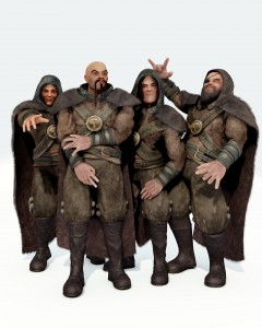
on March 30th, 2010, by benI’ve been meaning to get back to the guardians ever since I posted the last render of them. Personally I wasn’t happy with them but we needed to have something that at least worked on a basic level in a short space of time. If modelling gets held up, rigging gets held up and Lee and Colin needed to get on with planning and animating the fight scenes.
This is where I left them.
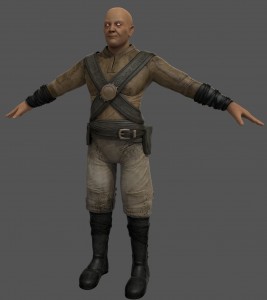
However, things have changed here and we are down to just the one guard. This makes things a whole lot easier to manage. While there still isn’t much officially scheduled time to work on them at all, one character is something I can realistically chip away at and I finally got around to starting that over the weekend, the progress is below. (Click for larger image)
Still more work to go and details to add back. I also haven’t forgot that the community lent us a hand with details so I also need to sort through those resources to see what fits with the rig, the animations and so on. For example we had a pretty cool bow (as in arrows) made but the scene and his movements wouldn’t work if it was mounted to his back like the original concept art. Skin, eyes, hair and metallic details still need work in case that isn’t clear.
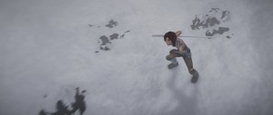
While I’m writing a post I may as well throw in a WIP render of the snow scene which is what I’m actually working on these days. Her staff is proxy, she will have a cloak of some sort (still planning how that will work exactly) and there will be falling snow as well. Her hair is still going through a lot of work too. Things like fog crawling along the ground would be nice but many of the shots in this sequence go so quick I’ll have to see if it’s worth the added time given the schedule. Also need to tone the shadow down a fair bit as it is quite overcast. Anyway, without further rambling here it is: 🙂
(I don’t blog much, forgot the high res link. Thumbnail fixed)
–Ben.


March 30th, 2010 at 12:11 pm
Wow, sintel vs guardian, go fight
March 30th, 2010 at 12:19 pm
You forgot to upload a highres of the snow scene render…
March 30th, 2010 at 12:20 pm
Nice work with the guardian, really hires textures.
But that was one small render of the snow scene, did you forget to link it to a bigger one or are you just teasing us?
March 30th, 2010 at 12:22 pm
I would say that apart from skin, eyes, hair and metallics you should also work a little on his pants. They look like they’re made of concrete :S
March 30th, 2010 at 12:28 pm
The gaurdian looks much much better than the previous ones 🙂 . Is the snow scn render, only a thumbnail? coz i am not able to click on a hi res version of it (if there is one 🙂 ) . anyways awesome work. .. keep is comming 🙂 . \m/
March 30th, 2010 at 12:33 pm
Sounds really good! I wasn’t able to click either of the images – but I am browsing on a iPod Touch so that is properly the reason.
Good luck with further progress!
March 30th, 2010 at 12:37 pm
…found the hires version:
/wp-content/uploads/2010/03/snow_blog.jpg
March 30th, 2010 at 12:42 pm
Yeah something is wrong with the thumbnail thing, here the full-res version:
/wp-content/uploads/2010/03/snow_blog.jpg
March 30th, 2010 at 1:29 pm
That was the first thing I noticed also. The pants looked like concrete. And some thing looks weird with the proportion. Like he needs to be longer or something.
March 30th, 2010 at 1:29 pm
Hey Ben, you’re doing awesome work mate.
Not sure if its worth much, but I’ll vote for the fog moving along the ground to be included. Its those little things that make a film so immersive.
March 30th, 2010 at 2:08 pm
To be honest, i dont like the skin shader.
There should be an ambient occlusion between the wrinkles and the highlights.
Regards
March 30th, 2010 at 2:11 pm
Sintel is gonna die…………..of hypothermia. I hate to sound like someone’s mollycoddling mom but there is no way someone dressed in the clothing she is in would last an hour in subzero temperatures her gear should be looking like that of an inuit.
March 30th, 2010 at 2:11 pm
doh forgot to add that the guardian looks much improved from the previous versions he looks more put together
March 30th, 2010 at 3:14 pm
(@tyrant monkey: As Ben said, she’ll be wearing a cloak.)
Wooh! Another render, yeah! 😀
I like the Guardian’s adjusted color palette, now; it’s much less crude and a little more like David’s concept. 🙂 I hope that it’s unnecessary and obvious for me to say, but Lao Tseu looks like a big plastic action figure. Work still needs to be done to make his clothes look like clothes, which is simply a shader/bump problem for the most part.
Gracias for the awesome Minute 1 WIP render! 😀 It is awesome.
I agree with the stuff about killing the shadow and I support adding some so-called “fog” to the ground. By that, I don’t mean that I want to see actual fog, but rather powder snow being blown across the ground by the wind (it better be windy or I’ll be let down! :P).
To elaborate more about the shadow, I could see it being eliminated altogether if not made terribly diffused like that of an area lamp. Such lighting conditions, however, may not look terribly epic; it’d require overcast conditions and therefore flat lighting.
So, I might propose, if that doesn’t suit, for you to light with a low-set sun. It will barely make an ugly shadow on the ground, and it will give you great oppurtunities for striking key or rim lighting as well as lively color contrasts of blue-yellow if you so chose.
Additionally, I just want to say that the rocky part of the ground looks too light; it’s lighter than Sintel’s hair.
But anyway, great job, Ben! 😀
March 30th, 2010 at 3:31 pm
woah, nice!
textures look awesome!
March 30th, 2010 at 4:09 pm
I like the way Sintel’s body materials look realistic like where the shoulderpad meets the skin.
March 30th, 2010 at 4:13 pm
@D I know he said she would be wearing a cloak but that doesn’t really cut it for winter gear. I also spotted that when the first sprint went out there was a call for winter gear for Sintel. I just assume nothing fitting the standards of the team was made which is a pity really
March 30th, 2010 at 4:43 pm
Ooooohhhh well, Ben, now that’s very nice. The guardian is so greatly improved from the old initial version, now texures ARE textures, very detailed and really hig-res. Colors are way better than previous and more fitting David’s concept.
If I can, the only thing still doesn’t work well for me is about too much specularity over the clothes, making them too plastic in my opinion. Other than that, everything works very well and is going in the right direction!! 🙂
Can’t wait to see improved skin, eyes and metal shader too!
Sooo nice work so far!
As for Sintel shot, I really like it, it conveys a lot of mood and dynamic!
I must agree with tyrant monkey, she can hardly survive half an hour in that environment with such a clothes over her, but well… she’s our heroine after all, so if the Durian team shouldn’t have the time to sew her something more fitting the rigours of winter we can definetely turn a blind eye 😉
Also, she’s directly going in a warm shaman hut next scene, not to mention she’s been somewhen touched by the heart of a dragon… 😀
March 30th, 2010 at 4:50 pm
Ah! Almost forgot…
… a warm “Welcome back!” to David!!
p.s.
such a beautiful ‘monitor’ you’re working with this time! now I catch the meaning of 4k production… 😉
March 30th, 2010 at 6:20 pm
Well I’m nitpicking / giving some suggestions:
Guard:
Black leather stripes at the arm: Specular value would imho profit from beeing a bit stirred up / slightly varied by a procedural. (Leather reflectivity usually varies a bit.)
Snow Scene:
Now this is hard, played a bit with the image inside gimp (simple curve manipulation) and I think the hair issue is mostly because it is much to saturated and dark in contrast to the rest of the scene.
(more specularity ? / some reflective highlights ?…don’tknow
but again, this is really GREAT work.
March 30th, 2010 at 8:20 pm
Woow, Great work Ben! 🙂
I don’t know if this is in the original design, but the black leather bands on his wrists seem brand-new (very shinny), perhaps this is because he regularly wipes his face with them, so the sebum makes it so? (sorry, this is disgusting)
March 30th, 2010 at 8:25 pm
Jeez people,
There’s constructive criticism, but did everyone miss that this is a really nice, nicely textured work-in-progress character? That he’s really improved since we last saw him? That theres a bunch of beautiful details like the straps and stitching around the neckline.
Ben, I’d like to be one of the first to say that this is a beautiful work in progress with great potential. The carvings on the straps work really well as do the overall colour pallette. I’m really looking forward to watching his development.
Seeing Farsthary’s sand simulation video also makes me wonder what cool stuff could be done for where the characters are moving in the snow, eg footprints, wiping a coat of snow off the ice when Sintel is knocked down like the Lich King does with his hand near the start of “The Wrath of the Lich King” trailer…
Anyway, just wanted to say I love your stuff and it looks to me like you’re doing some great work going in the right direction. Keep it up and Go Durian! 😀
March 30th, 2010 at 10:32 pm
Hi Ben!
At one point in the production, you (don’t remember exactly who) asked for help from the community regarding the guardians. I made a Lao Tse but never really got a concrete answer about its usefullnes.
Now I’m posting it again, maybe it still can be of some help.
Here is a snapshot:
http://farm5.static.flickr.com/4066/4356792151_fb23629043_b.jpg
March 30th, 2010 at 10:37 pm
Oh, I forgot to say I can upload the model and textures to the ftp.
Thanks!
March 30th, 2010 at 11:26 pm
No trails on the snow?!
March 30th, 2010 at 11:42 pm
OK, first amazing work! This is some of the best stuff I have seen in a while, I am hardly able to contain my enthusiasm.
Constructive Criticism:
The Guardian … I am not sure if his base mesh is finalized yet but I find his hands a bit distracting. Looking at his other attributes (barrel chest, thick neck, etc) his hands just look fat. They don’t look like the hands of a person who uses them for a living.
For instance, there don’t seem to be any tendons visible beneath the skin and no real distinction between the knuckles in the digits. Also, the spec on the skin could probably be turned down a bit, unless he is supposed to suffer from eczema : (
All in all it is very good, light years beyond what I can do. Please take these comments as only my layman’s suggestion. If you were to heed none of them it would still be an amazing product!
March 31st, 2010 at 1:21 am
Ya gonna give the guard some hair right? 😛
But I think he’s to chubby (won’t call him fat, he might get mad and attack me lol!) and he could use more warn-down clothes. IMO of course.
Awesome work so far!
March 31st, 2010 at 1:37 am
Great improvement on guardian, nice job.
And sintel shot looks promising.. but i think that she need more clothes plus that cloa! It’s a cold world out there : )
Btw.. the most important thing :
From this night we can SAVE UI COLOR THEME as blender defaul..jeeeey ^_^
THANK YOU! : )
March 31st, 2010 at 1:41 am
I feel like the specularity maps are good as far as small detail go, but the large grunge/larger details in general are not present. The clothes feel a bit stiff, and his face’s specularity definitely needs work, that said, it looks a ton better.
Keep up the good work.
March 31st, 2010 at 1:51 am
Detail of my Lao Tseu:
http://farm5.static.flickr.com/4040/4356822133_5f1da381e4_o.jpg
And a stylized version:
http://farm5.static.flickr.com/4034/4477099455_7741a90489_b.jpg
March 31st, 2010 at 3:48 am
Would love to see a little blue in that snow there. Looks more like cotton to me than frozen water.
March 31st, 2010 at 3:49 am
http://en.wikipedia.org/wiki/Uncanny_valley
The most important part of the character is the animation of it. Even a human character made of 3D primitives can dutifully serve his purpose in an animation.
A realistically textured, feature exaggerated, hastily animated guardian probably fits into the bottom of the uncanny valley too…
March 31st, 2010 at 4:36 am
Agree that “fog” would be cool, except for there’s no such thing in the winter. But if there’s time, blowing and falling snow will produce exactly the same effect (except much more fun!).
March 31st, 2010 at 2:55 pm
second BX post:
there is no trails on the snow? Footprints?
March 31st, 2010 at 3:13 pm
@J09: http://www.lmgtfy.com/?q=winter+fog
March 31st, 2010 at 5:41 pm
@Dundee:
That was hilarious! However, J09 is TECHNICALLY correct when the temp drops below the freezing point of water (which depending on its salinity can be quite low) traditional “fog” is not found. However ICE FOG is prevalent in some locations, as well as what some people think is fog but is actually wind blown ice.
March 31st, 2010 at 7:18 pm
the finger nails dont seem very… idk…
it just seems like his finger is a bit cylindrical with a nail texture… it could just be the SSS (?)
April 1st, 2010 at 12:15 am
Looks real nice already. 😀 I really can’t wait to see the whole thing.
BTW. Just to give some possible ideas. I found this and to my knowing you already use something similar in the render branch. http://www.youtube.com/watch?v=GckOkpeJ3BY although this one has a lot less rays it still gives quite nice results. In the big areas at least.
April 1st, 2010 at 3:22 am
Juan Romero: super nice renders, he looks much cooler now!!!
April 1st, 2010 at 3:25 am
Wow, while Ben and Juan’s (realistic) versions of Lao Tseu are quite different interpretations of David’s original concept art, they are both exceptionally well done. I think there should be a duel to the death between the two versions, to decide who deserves to be in the film!! 😀
Seriously though, if they are based on the same mesh would it be possible to somehow use partial body morphs to somehow frankenstein them together to get the best of both. Similarly for the textures. I guess it will be more likely for Ben to look through all of the contributions to work out what to include in his version and what to leave as is.
Also, I think it works that Sintel is not wearing proper gear for the environment. It could indicate that she went on this journey impulsively without taking the time to prepare, and could certainly explain the collapse at the end of the fight. Perhaps it’s hypothermia that’s one of the causes and not just fatigue and wounds from the battle.
April 1st, 2010 at 3:45 am
“Also, I think it works that Sintel is not wearing proper gear for the environment. It could indicate that she went on this journey impulsively without taking the time to prepare, and could certainly explain the collapse at the end of the fight. Perhaps it’s hypothermia that’s one of the causes and not just fatigue and wounds from the battle.”
Precisely! It’s not like she’s in that condition on purpose. (Or at least we have no reason to believe she is). Let the people tell their story.
April 4th, 2010 at 2:57 am
I think in this frame she looks like a character from The Moomins. Just look at her face!
April 4th, 2010 at 6:50 am
It’s sad that there’ll be only one guard. But if you guys do really have to do whatever it takes to meet the deadline, go for it.
April 4th, 2010 at 2:48 pm
Ok so the first lot of guardians are not going to be used. Are there models going to be released anywhere.
Really I was worried about suggesting this idea for them before I saw if they were alive or dead by end of film. Not going to be dead hey I can now suggest it.
I think all 4 would look cool as a rock band and with sintel as female lead singer.
April 4th, 2010 at 11:47 pm
No comments from Ben :[
April 6th, 2010 at 11:37 am
The only crit i have is that he must be a eunuch…
There’s no space in the groin of those pants! ouch!