Snow Environment Design
on December 15th, 2009, by benDavid didn’t have enough time to do much design on the snowy environment before he left, which gave me a chance to do it. Now that the fight choreography is well underway I have been doing sketches, talking with Colin and the others and working out a an environment design that looks cool and fits the requirements of the fight. It almost goes without saying, but for the sake of those who are newer to 3D and Blender – the more fleshed out the concept art is the easier the rest of the process becomes. It’s something that took me a while to fully appreciate while I was starting out so I thought I’d just mention it anyway.
Same deal as usual, click to enlarge:
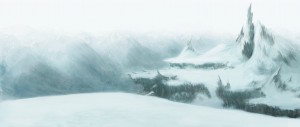
1. Concept painting
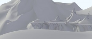
2. Flat render of the proxy environment WIP
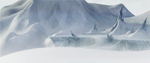
3. Paintover of the proxy environment WIP, just to help everyone visibly check it’s still heading in the right direction. Can’t have everything stuck in the back of my head because I’d much rather make changes we are all clear on now than after a week or two of solid work.
Through rounds of feedback there will be changes to the structure, look, feel and so on but for now the file is over to Colin to start moving cameras and character blocking for the layout. The background mountains can obviously be changed around a lot but you will notice that within the space of a day the horizon is already very different to my first painting. This way it feels more like a part of an epic landscape, rather than having the fight conveniently take place at the pinnacle of an epic landscape. Decisions, decisions…
Software was Gimp for anything painting related, Blender 2.5 for the little bit of modelling so far. The concept art was all done in Gimp, blending some photo reference into painting. Also to re-iterate, the environment model is simply blocking in the forms for Colin to plan the shots. Then based largely on the shot placement, the actual set will be modelled.
– Ben


December 15th, 2009 at 9:36 pm
Good! looks promising.
December 15th, 2009 at 9:48 pm
David is missing …
December 15th, 2009 at 9:54 pm
Very nice looking. Will distant parts of the environment be matte painting?
December 15th, 2009 at 10:15 pm
The model looks promising, the painting looks great. In my opinion, the painting’s still a lot better than the 3D version but I’m sure you get the model to this level, too. 🙂
December 15th, 2009 at 10:16 pm
Looks athmospheric, shouldn’t this article be signed with a name like the others? I like seeing names 😛
December 15th, 2009 at 10:16 pm
looking nice
Is this only a painted image or computer generated?
and done with which soft ?
may be new volume feature in 2.5 ?
happy 2.5
December 15th, 2009 at 10:22 pm
the ice “spikes” and other shapes shoud go in the same direction. the wind sculpted them with the years.
more inspiration http://i.neoseeker.com/ca/unreal_tournament_2007_conceptart_TKkdb.jpg notice the shape
December 15th, 2009 at 10:36 pm
@Bart Robinson – Probably a mix of matte painting and model / texture for the surrounding mountains and background. Depends a lot on how we enter the scene. Colin might want to pan over some mountains and so on.
@Alexander Carby and Rickyblender – updated the post a bit. Was trying to finish quick so I could get home a little earlier than usual.
@wo262 – Interesting point, it’s heading towards a stylised film, but Colin and Nathan in particular like to think in terms of what would make sense in the scene and why. Will look into it. A prime example of why the various iterations, checking and planning are important. 🙂
December 15th, 2009 at 10:41 pm
http://www.blender.org/development/release-logs/blender-242/blender-material-nodes/
You might find the ice node-material by Andy useful 😉
December 15th, 2009 at 10:53 pm
really AWESOME 😀 wish i could make good stuff like that…
…i think i need to practice sketching, i’m gonna need to do stuff like this 😀
really awesome 😀
December 15th, 2009 at 11:00 pm
Looks very nice. The dead looking paisage in the third image makes me wonder.. What kind of infra-structure is behind that gate? hmm.. The place is hostile, the keepers are hostile. I am definitely curious 🙂 But this is a WIP. I also wonder if there will be more visible rocks/colours and few signs of previous visitors/civilizations. I shall have to wait for the final piece 😀
December 15th, 2009 at 11:09 pm
Real landscapes don’t look like that. Outcrops should all be aligned.
google for jagged rocks:
http://images.google.com/images?hl=en&um=1&q=jagged+rocks
December 15th, 2009 at 11:44 pm
Cool work. I love the initial concept and I think it is much more successful at feeling “epic” than the later iterations. I can understand the reasoning for wanting the sequence to take place within an epic landscape instead of just on top of, or in front of one, but I think it would feel that way if the first image was the establishing shot and the fight actually took place among the outcroppings on the right. Then, if the biggest outcropping was the same scale as the mountain you used for the later 3D proxy images then the sequence would feel both epic and intimate at the same time.
December 16th, 2009 at 12:20 am
Horrible concept, spiky landscape and no snow particles + vector blur.
Please use this as your concept and reference:
http://www.youtube.com/watch?v=WrkXHW3L7Nc&feature=player_embedded
December 15th, 2009 at 11:37 pm
Hello everybody,
Excuse me, but i don’t write very well english…
i just want make one little remark, i don’t love your mountains (picture 2 and 3), why it’s easy…
If the camera is at the height of the eyes into the 3 pictures, we can see (picture 2 and 3) that you have 2 flat mountainous plateau in the middle of the view, because they are horizontal, It bothers me a little.
In the picture 1 (Concept painting) the 2 mountainous plateau aren’t flat and fill all the middle of the view, because this 2 mountainous plateau are bent slightly (until) to the top. They are in montains…
Everything else is good, sorry for my outspoken, and good work for the Upcoming work
December 15th, 2009 at 11:38 pm
I love your work !
December 16th, 2009 at 12:44 am
Your concept painting is far superior to the render paintover.
December 16th, 2009 at 12:44 am
Yeah Lich King cinematic so nice. Blizzard used a matte painting and camera projection on low poly surfaces to make their enviroment so awesome in the .
Here’s a making of:
http://www.cgchannel.com/news/viewfeature.jsp?newsid=8144
and a link to the hi-res version (cause the youtube one sucks)
http://www.worldofwarcraft.com/wrath/intro.xml
December 16th, 2009 at 12:51 am
@Shiretoko
We (or better siad the Blender Team) is unique, as same as the Blizzard Team made a great Trailer for its game. But we do not need to copy another idea or try to be conform with it.
The Blender Team has a concept and shares the concept with us, which allows us to learn how a team of about 10 people creates within 6 months an 8 minute animation for 4K. Please do not start to call it horrible or crap. Instead learn how to model great meshes, draw with open source software scetches and later on to rig and skin people. It will make you better and that’s about this project. To make Blender better and to show you how to create this quality as a hobbiest – or do you work for Blizzard? I would love to learn from you how you did this trailer and would love to see the mesh and the concept. Please feel free to share it with us.
December 16th, 2009 at 1:12 am
@Guybrush Threepwood:
The Blender Team are the ones that put that trailer as a reference and concept: /mood-board/
I am only reminding them.
December 16th, 2009 at 2:09 am
we did sometime ago
some nice iceberg if you need this type of icy scene
Iceberg
http://blenderartists.org/forum/showthread.php?p=1510041#post1510041
it’s very cool and cold
happy 2.5
December 16th, 2009 at 2:53 am
Ben, don’t listen to them:
This shot is horrible! It is not even well painted.
It’s cool to heard about 4K but 4K of “nothing” doesn’t make something.
Guybrush:
I don’t think that all these non-stop “hooray” from fanboys when they see a pixel – and this one is really bad – can really make this production gains in quality! OK, harsh critics also, but the project has started 2months ago.
You should stop to do police or the big brother, they are matures enough to talk by themselves.
Honestly, i prefer to see less blogging and see sometimes one or two great updates not a three brushes strokes layed on a canvas.
Please, stop the style “RealTV” show and spend more time on the work.
Best Regards!
December 16th, 2009 at 4:27 am
I wonder, in addition to some points already made above, whether the team was okay with the the dead flatness of the center stage compared to the rest of the landscape.
I just wonder; I don’t know whether or not it might be inappropriate in some respects.
The general look and feel of the concept art is great, though. 🙂 If you’re keeping with the big mountain in the background, I think obscuring a lot of it with snow and fog, especially near the top so you can barely tell where it ends, would look great because its prominence in the composition right now distracts attention.
Good work, Ben. 😀
December 16th, 2009 at 5:17 am
You know, after GIMPing what I just suggested, I REALLY like your mountains, Ben! 😀 It made so much difference to me.
http://i49.tinypic.com/288pq12.jpg
What’s left is some volumentrics on the fog so that the background mountain casts a shadow over the right area where the plains are, making a light-dark contrast thing happening. 😀
December 16th, 2009 at 8:14 am
bad…. , :/
December 16th, 2009 at 9:16 am
@Shiretoko I was wondering why you said these guys must watch the Wraith of the litch king trailer. Mate do yourself a favour and track down the trailer with the making of in the beginning you will see that before all the texturing work was done Blizzard’s icy landscape of Northrend looks like flat proxy render that Ben has made.
when it’s modeled to the final quality and textured it will look better. Its unfair to be demanding final quality stuff when it is stated that this is a proxy enviroment.
Another source of info I would recommend is the Beowulf concept art book. It full of flat proxy renders that show how enviroments for that movie were roughed out before been modeled to full quality. Those proxy renders are of similar quality to the work shown here.
December 16th, 2009 at 9:30 am
Yeah Lich King cinematic nice. Blizzard used a matte painting and camera projection on low poly surfaces to make their enviroment so awesome in the .
Here’s a making of:
http://www.cgchannel.com/news/viewfeature.jsp?newsid=8144
and a link to the hi-res version (cause the youtube one sucks)
http://www.worldofwarcraft.com/wrath/intro.xml
December 16th, 2009 at 1:29 pm
I actually like the way the spiky ice goes different directions. It appears that the prevailing wind is left to right, but, as shown in the paint over, the plateau creates vortices as the wind hits the vertical surface, causeing drifts that grow right to left. With rain and sun, parts of these would become ice.
I do think the far overhang, with vertical icicles needs to have a reason for the lack of wind. Otherwise the same wind that is keeping the rest of the overhang smooth would have destroyed the icicles. Perhaps a hummock or large bolder in front of it, creating a lee?
Along with the same prevailing wind pattern, the mountain peak in the top right should have a steeper decent on the right edge, accounting for the drifting of snow. Snow drifts are caused by the sudden decrease in velocity as the wind passes beyond an object. The drop in velocity causes it to drop a portion of whatever it is carrying causing the deposition of snow on the leeward side of objects. Most of the snow deposition will occur at the boundry between fast and slow moving air.
When painting/modeling your wind driven snow, you might also want to create ‘tails’ of snow over the crests of peaks.
I think it looks great, BTW. Solid foundation to dress up. 🙂
December 16th, 2009 at 3:40 pm
it feels lonely and cold. it feels hostile (at least for humans). can’t wait to see sintel in that scene.
December 16th, 2009 at 3:44 pm
I too prefer the initial concept painting. I think it’s because everything appears to be too flat instead of being rocky and jagged in the render.
Would you guys consider doing an open call for concept art for some of these scenes. Commercial projects often have dozens of artists coming up with possible concepts for the same scene so the Director has the chance to pick the best one. You have a whole world of potential concept artists out there. Why not make use of them? If you still want it to be a surprise you wouldn’t have to publically announce which concepts were chosen.
December 16th, 2009 at 4:33 pm
@tyrant monkey
Thanks for the hint that there is a making of the Wrath of the litch king.
Here is the link
http://www.cgchannel.com/news/viewfeature.jsp?newsid=8144
Great article talking about exactly the same issues the Blender Team faces in the next weeks and months.
They talk on page 2 about the matte painting and that they started from a low-poly approach and went to a high-end product
“…We have a really strong matte painting team. One day we’ll be looking at some extremely low-poly-looking cliffside, and a few days later we’ll have a sweet-looking, close-to-final cliff…”
Funny that sometimes from blurs of DOFs this hard work again vanishes ;). But that’s the art of the director. Colin be merciful 😉
December 16th, 2009 at 4:41 pm
@All – It seems I posted this too early for some people, being a blocked in proxy render and all. Thankyou to those who realised that it is showing the first steps of planning an environment, not the environment itself.
Ton is also someone who wants to see finals as soon as possible, which always sounds like an odd request when you know that there are a lot of tools that are getting overhauled or added between now and when we render certain shots a few months from now. Fair enough from a producer’s point of view.
As for the Lich King trailer – that has been our reference. Each time i try and sneak more colour and contrast back in, Colin keeps wanting to tone it back down to be grey and harsh and foggy. His choice as director. Snow falling and fog over distance we can do. The structure of the environment is far more important to figure out at this point so the animators can have a scene in which to animate. That is why the background setup of the mountains – their scale, placement, amount of fog, horizon levels can be changed at any time.
I will think much harder before I post again, in hindsight the renders were too early to post with the concept and there wasn’t enough text to explain to everyone exactly why they were posted.
December 16th, 2009 at 6:02 pm
Don’t feel to bad Ben, I personally think some of the comments above are uncalled and unjust. The concept art really is looking amazing, it has it’s own atmosphere and look, which from a concept piece point of few is a very good thing. It’s an original perspective.
The critiques that I have are minor, but I think they are worth mentioning. The first image has an epic feel to it, I think this is mainly down to the smaller mountains used in the background, It suggests to me that the placement for the fight is located in a very dangerous place, high above a snow/ ice covered valley. The 3D paint over, loses a lot of this epic feeling due to the one large mountain which peak is clipped off screen. I think that a combination of the smaller mountain range and one large peak rising above them in the distance would better serve the composition of the image.
Secondly, the flatness of the Plateau (right word?) puts me off the image, in the concept image the ground is quite uneven, which helps portray the harshness and organic feeling of the environment. I totally understand that this isn’t final and merely serves as an extra concept stage, but I do think it would be better to add some variation to the ground and also the section of the rock/ ice that is leaning far out, would in my opinion, do more for the image if it were slanted at an angle, both horizontal and vertical (Think of it as reach toward the high peak in the background).
Just my two cents.
🙂
December 16th, 2009 at 6:28 pm
I kind of like the second & third concepts better. In the first you get the feeling of being on A mountain, but in the renders you get the feeling of being on THE mountain. In reality, mountain ranges often look like the first concept from a distance, but when you are on the face of a mountain often all you can see is more of the same mountain & maybe one or 2 of its neighbors…The range is hidden from view. Keep up the good work, I look forward to the final product!
December 16th, 2009 at 6:45 pm
heya:)
these are looking awesome already!!!..I can imagine that these are gonna look great in the final shots when all the compositing and tweaking magic took place. I really like the mood and with some snow swirling around it will give some chilling atmossphere.
I wonder if theres gonna be blood in the fighting scenes..since blood and snow usually make a creepy combination :D…
Cool WIP, thanks for sharing where this is going!!!
Best regards to all the team!
December 16th, 2009 at 7:42 pm
Please don’t be discouraged by the negative feedback. There are still those of us who really enjoy seeing the early WIP stages and getting a sense of the progression of the project. You are all doing a fantastic job and I’m extremely excited to see the continued development of the project.
Thanks for your hard work!
-DLH
December 16th, 2009 at 9:34 pm
The paint-over missed the fogs.
It’s good, never the less. 😉
December 17th, 2009 at 1:39 am
@Ben : thank you very much for sharing stuff at very early stage of development, so that everyone may really see how much work is put into these scenes to get from concept art, to rough models, to final astounding environment. I am really happy to see that scenery slowly evolving to full maturity.
December 17th, 2009 at 3:38 am
Awesome job Ben! Only one crit: the icesicles from the cliff where the spikes are, I think they should be slanted to the right like the spikes, because the wind was blowing them too, right?
December 17th, 2009 at 1:00 pm
I second the notions brought forth by DLH and Sly, I love seeing this early work and watching it grow and evolve.
I’m personally curious about how Sintel gets from being in a desolate snow landscape to being in a shaman’s hut to being inside the HUMONGOUS doors; I can’t wait to see how it all ties together (especially in 4k), so many different environments and landscapes in such a short time, should be a wild ride.
Loving it.
.:Josh
December 17th, 2009 at 2:54 pm
I like all three pictures. Not long after I saw them I said to myself, a snowy plateu with a giant mountain behind it? Sounds like Artists Point on the side of Mount Baker in Washington State. The switch backs to get up there are so tight that I scraped the pegs on my 250cc motorcycle, I have no idea how RV’s get up there, but its a similar view and closed most of the year for all the snow. Keep up the awesome work, I love these posts.
December 17th, 2009 at 8:53 pm
as stated before. You should not feel any bad for posting very early work. Actually, I guess I speak for all when I say that following the steps is very nice. Part of the spirit of being open.. suggestions, heavy anxiety, extensive documentation on ice shapes et cetera 🙂
December 18th, 2009 at 7:25 pm
I too like the early drawings and showcase. I don’t think there is any such thing such as too early a posting. A couple of sketch lines on a blank page would be fine. So much can be learned by the early parts. I know that I am just a learner. Seeing all these parts is helping me develop my own work.
Keep up the great work!
To all the others, remember, these are all people, not automatons. They are all constantly learning as well. Treat them gently or we may lose the opportunity we have to see all this early work!
Greydesk
December 20th, 2009 at 5:09 pm
I really like that first concept painting.
If the final render turns out like that, then all the negative fires should be well and truly put out 😉
The mountains in the back left in particular feel very massive and cold. It makes the distance between them and the foreground plane of snow seem huge. The front right mountains are also looking very good in that image, very whispy and fantasy-like, which I imagine is how the overall style will turn out for the film, something which Im definetly looking forward to seeing.
Everyones commenting on the unrealisticness of this scene, but who cares?? Why recreate images we can see every day in real life or photos? The Durian team have a chance here to use blender to make something unique and memorable, I hope they do.
December 21st, 2009 at 1:17 pm
Wow, after reading some of these comments, I’m thinking, how can some people be so anal?
Really, these guys are doing amazing stuff considering that most of them are members from the community and have never worked for Blizzard, Pixar, Disney. I mean get a grip people. If you don’t have and ounce of people skills, then don’t try and inspire people with your negative blabber. Yes, constructive criticism doesn’t necessarily need to be negative. They will let just about anyone on the interwebz these days.
@the blender team, well done guys, I’m looking forward to the movie, it’s shaping up well. You shouldn’t be discouraged by the few rotten apples. The work you do inspire people like me and you have shown the world that good quality and high production values can even come from a small but dedicated team with a humble budget and toolset.