Wallpapers #1 : Concept art
on October 29th, 2009, by DeevadHello,
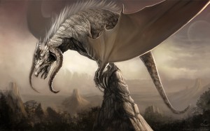
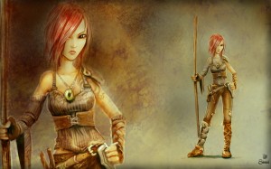
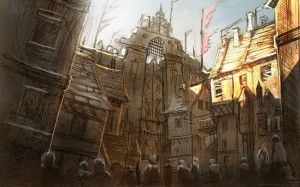
I got some comments and emails last days about the availability of some desktop wallpapers with the concept arts. While reading those, I thought it was a bit early cause I can make them better a good idea. So, I did three 1920×1200 wallpapers ( if your screen is lower , you can still scale them down ). And while I was playing, I tweaked too the blog wordpress theme.
-David


October 29th, 2009 at 11:20 am
Great work, like always. Thank you David!
October 29th, 2009 at 11:27 am
Nice work David, these look really cool!
October 29th, 2009 at 11:28 am
You are an error in the link the first wallpaper is the same the second.
Replace : sintel-wallpaper-sintel.jpg
by : sintel-wallpaper-dragon.jpg
bye
jeanjo
October 29th, 2009 at 11:39 am
The art is stunning. Maybe you could upload a whole pdf of all the artwork thus far? 😀
I mentioned this before, you should resize void.png (the empty clicky thing) of this website to fit over the new title. Whenever you have time.
October 29th, 2009 at 11:39 am
Thanks !
@Jeanjo: you were right,thanks ; fixed !
October 29th, 2009 at 11:46 am
wow…nice work 🙂
Thanks David for This Share
October 29th, 2009 at 11:46 am
@D : Thanks for your comments ( and your fidelity t the blog 😀 ) & to help me to fix this website, fixed ! a PDF artbook ? good idea 🙂 Btw, we want to change the mood board into a gallery in few days.
October 29th, 2009 at 11:54 am
Good work, for your fast response. :O All this news is making me bristle with anticipation. xD
October 29th, 2009 at 12:02 pm
its always fun looking at your work that pdf art book does sound like a good idea
October 29th, 2009 at 12:04 pm
Well, after 4 years with the same wallpaper, the dragon finally replaced it 😉 Thanks!
I’m rather curious how you made the scales…
…Humm! Btw why not change the button “Get your credit!” by “Get your DVD!” 😛
October 29th, 2009 at 1:06 pm
Awesome david, sintel is now my new background 😀
October 29th, 2009 at 1:07 pm
If those are quick Wallpapers, you “could do better”, I can’t wait to see those 😀
Though, for both of my screens I’d have to distort them…
Aww, I wish I had some rescale-app like this year’s (I think it was this year’s) siggraph, combining standard rescale, crop and the “content aware” rescale into one rescaling process 🙂
(the content aware one alone gives ugly lines and stuff…)
Ok, enough rant, back to topic…
Nice new look, I especially like the baby dragon, holding the BLOG link 😀
Though I dunno why but the Sintel-font on top of the header image…. They kinda don’t fit together… maybe because “Sintel” is quite vivid and strongly outlined but the background is a bit loose, dark and washed out…
October 29th, 2009 at 1:11 pm
Really nice work!!! Loving all of these!
October 29th, 2009 at 1:39 pm
@Rogper : Thanks Rogério ! 4 years with the same wallpaper ? whaooaoo , I’m proud to replace with this dragon a surely very good one !
Thanks for “get your credit” ( it was outdated ) I fixed it with fancy gnome DVD icones.
@Month3D : Thanks !
@kram1032 : Thanks for your crits on the title ; but I think we will change it soon, I’m lazy to change it now , even if I see what you mean by “strongly outlined” 🙂
For your rescale-app ; try this plugin with Gimp : http://liquidrescale.wikidot.com/
October 29th, 2009 at 1:47 pm
@kram: Online liquid resizer:
http://rsizr.com/
October 29th, 2009 at 2:17 pm
thanks Deevad and manitwo, though those are not what I meant.
They often give nasty lines. There was an other siggraph paper about a different technique, combining the three ways rescale bicubic, seam carving and standard crop, line by line by estimating, which of the three techniques keeps the image most similar…
October 29th, 2009 at 2:26 pm
made
with gimp???????????
October 29th, 2009 at 2:40 pm
@kram1032 : oki 🙂 for this I have no idea, but if someone find it, I’m interrested too.
@too : my software list under :
Alchemy : http://al.chemy.org/download/
Mypaint : http://mypaint.intilinux.com/?page_id=6
Gimp : http://gimp.org/downloads/
>gimp-for-painter : http://fr.sourceforge.jp/projects/gimp-painter/releases/?package_id=6799
>Gimp Paint Studio : http://code.google.com/p/gps-gimp-paint-studio/downloads/list
for more info on my technic : /news/tutorial-painting-time-lapse-by-david-revoy/
October 29th, 2009 at 2:42 pm
too : Yeah that was made with opensource softwares like gimp…
October 29th, 2009 at 2:42 pm
@kram1032,
“Optimized scale-and-stretch for image resizing”.
October 29th, 2009 at 3:07 pm
@Deevad:
It wasn’t nothing special actually ( http://yfrog.com/1qffviiacrogpermakinawalpj ), I never replaced it just to remind me every day the quality level that I hope to achieve one day 🙂 …the same applies now to the new one 😉
October 29th, 2009 at 3:07 pm
@D:
Wow, that’s also a nice technique I didn’t see sofar. Also very interesting 🙂
October 29th, 2009 at 3:10 pm
Wasn’t that the one you wanted? 🙁 It was at Siggraph 2008.
October 29th, 2009 at 3:14 pm
By the way, Durian peeps, four (4) DVDs??? Don’t scare me! 😀
October 29th, 2009 at 3:28 pm
You heard me!
October 29th, 2009 at 3:50 pm
@D:
Well, I’d be happy with that one too 🙂
I did a search now myself, but I wasn’t able to find the tech I meant sofar…
Though, I found some serious science on lol:
http://graphics.cs.ucr.edu/projects/simTorso/simTorso.html
October 29th, 2009 at 4:10 pm
Ok, it *might* be this, but the paper I’ve seen was different…
The google link lets you download it immediately… It’s a pdf.
http://liama.ia.ac.cn/wiki/_media/user:dong:dong_siga09.pdf?id=user%3Adong%3Ahome&cache=cache
Does anyone know, what’s the difference in documents that can be viewed in the browser and those which need to be downloaded?
October 29th, 2009 at 4:20 pm
FOUND!
http://liama.ia.ac.cn/wiki/_media/user:dong:dong_siga09.pdf?id=user%3Adong%3Ahome&cache=cache <- that’s it 🙂
October 29th, 2009 at 4:40 pm
Argh, I’m sorry… My Ctrl hangs a bit and it seems, Ctrl+C didn’t work at that moment…
The link is
http://www.faculty.idc.ac.il/arik/SCWeb/multiop/index.html
If I understand correctly, this technique could basically combine ANY technique for rescaling to get the best of all the single worlds…
Ok *stops hijacking this blog entry now*
🙂
October 29th, 2009 at 4:58 pm
but…but…but… I wanted to colorise again!
*trembling lip* and now it’s already done!
No fair, I have to go sulk because of the great artwork now.
p.s. keep up the good work 😉
October 29th, 2009 at 5:08 pm
PDF Artbook would rock. You could make a hardcover version for coffee tables too with all Durian artwork and sell it in the Blender store.
You should definitely put the Sintel concept progressions up in the Gallery like you showed at the Blender conference!
Oh on that note, I have a question about the mood board. Did you ask all those different artists for permission to post their stuff there or did you just find a bunch of cool images and put links back to the artists?
October 29th, 2009 at 5:46 pm
the best is in: http://www.davidrevoy.com/temp/timelapse-pictures/
October 29th, 2009 at 6:05 pm
cool, Durian wallpapers 😀
October 29th, 2009 at 6:09 pm
AWSOME! im getting home and putting this on my desktop 🙂
October 29th, 2009 at 6:56 pm
I THINK SHE LOOKS LIKE 40 YEARS WOMAN INSTEAD OF A ADOLENCENT.
Very Beautiful drawings though
October 29th, 2009 at 7:40 pm
Thanx David! They all look amazing! My new wallpaper is Ishtar because I’m totally in love with the art style you did on that one 😀
October 29th, 2009 at 7:56 pm
Hello, David, there seems to be another thing about the webpage that isn’t right on my IE: the hyperlink for the “blog” button is misplaced. It works fine on my Wii though. 🙂
See: http://i33.tinypic.com/r8bm14.jpg
October 29th, 2009 at 8:33 pm
@Agus3D I don’t agree that she looks 40 but she sure looks anoyed 😀
October 30th, 2009 at 12:28 am
Great work so far, but Sintel is too thin. I think you need a more “developed” lady. The animation of this lady is going to look like a teen boy with nice face, not a “women”. If you think in something like Ghost’s in the shell, Final Fantasy or the female aliens in avatar they have more mature bodies and I think a good animation of a female body is one of targets for Durian.
October 30th, 2009 at 1:23 am
Salut David,
awesome drawings i use ishtar for the first now too:) thanks for creating and sharing these works!!
I dont think that sintel should have more hips and chest..i like her:)
October 30th, 2009 at 1:35 am
Accommodate the link :
Our last Identi.ca
New blog post: Wallpapers #1 : Concept art http://bit.ly/3lUY67
October 30th, 2009 at 4:55 am
I am interested in the dvd
There are some discount ???…
I live in Colombia
October 30th, 2009 at 5:19 am
Nice work. However, I have very specific thoughts on how a dragon should look like and I personally don’t like this one very much. The wings look strange, the skin is to evenly, just lizard like scales, all the same size. I think almost all the scales have to have a different size. Each scale has to look like it has a profound purpose to be exactly there and at exactly that form and shape. A dragon I completely adore can be found here (it very “classic”, though):
http://unigine.com/download/heaven_hd.jpg
The benchmark this is out of (which is not yet available for Linux):
http://unigine.com/download/#heaven
Videos containing the dragon at some point, rotating around it, are linked there as well.
Hint: The skins of the wings have to grow out of the sides of the body. Sometimes they even go further a small way on the side of the tail. Then there obviously is no room for the feet of someone riding the dragon on the back. A rider have to sit in the neck of the dragon (the dragon has to be big enough for this). I like the approach that the wings are part of the front legs. For how this is done right watch “Region of Fire”:
http://www.milesteves.com/gallery/v/SCULPTURE/ROF-crouch-6.jpg.html
http://www.imdb.com/title/tt0253556/
Also look at pictures of bats and pterodactyl. Oh and here I assembled dragons that I like (conceptually):
http://panzi.deviantart.com/favourites/#Dragons
Here is a dragon that reassembles your pretty much (the horns point the other way), including a girl riding it on its neck:
http://kerembeyit.deviantart.com/art/The-Dragons-of-Ordinary-Farm-125792664
October 30th, 2009 at 5:20 am
Oh, and I completely love the town/city thing.
October 30th, 2009 at 5:39 am
On the pdf artbook: I don’t really see the sense of this. Just put up a annotated gallery. Hypertext is better than this strange media that pretends to be on paper.
October 30th, 2009 at 5:46 am
There is something amiss here on this website. The last comment is from me (panzi) but I somehow got the form prefilled with kram1032s data, even his email address (which should not be published, but now was)! How is such a bug even possible? This form should never be prefilled by the website, only by firefox/your browser. And I know that no one on my computer uses the nick “kram1032” (because I’m the only one allowed on MY computer, and as far as I know I’m not a multiple personality).
October 30th, 2009 at 6:14 am
Next time I look up epic in the dictionary I expect to your dragon picture there. Any doubts as to how great this movie will be have been wiped clean away in this past week.
October 30th, 2009 at 6:58 am
My opinion of Sintel’s physique is that it looks right: she has the look like that of a pentathlete, someone used to the strains of endurance. (Being able to see those fine, slow-twitch muscles on the model would complement that notion.) No huge boobs to slow her down, no wide hips to waste energy on swaying 😀
Her face does make her look older: sunken cheeks and scary frown that will lead to wrinkles. I wouldn’t believe it if I were told that were a face of an adolescent, so did the character’s age change from the first-first minute script?
October 30th, 2009 at 11:09 am
wooowo , epic answering list :
@qxfx: yep !
@rogper: thanks for the link, I understand why your old wallpaper had 4 years on your desktop. Nice FF7 advent children one. <3
@kram1032 : Interresting link, I didn't knew them.
@D : Exactly ; 4 DVDs !
@Hoxolotl : Thanks ! You make me remember to do a post with all the colorisation soon.
@Consideringthepickle : A Durian book project is on the way ( with hard cover ) and will be written by Tony Mullen ( http://www.tonymullen.com/Books.html ), I think the 2D concept art ‘artbook’ will be inside as well as all the history of the project. For the Mood Board, we simply found ‘a bunch of cool images and put links back to the artists’ ; in case of a complain , we would simply edit it.
Nice idea for the conférence PDF.
@look: Thanks 🙂
This link, is the link of the actual post ; wordpress send the link to identi.ca and identi.ca transmit back the link to my sidebar, but all this php code break a bit special characters.
@MeshWeaver, @Jacob: Thanks !
@Agus3D : Use the capital letter is egual to scream on internet. I think there is a more inteligent way to express your opinion more credibely than to use this kiddy method.
Developp a bit wisely your opinion, and we will start to talk if it reasonable about this age problem that annoy you. Btw, thanks for your “Very Beautiful drawings though”
@s0ndeb0k : Thanks, this one is my favorite too, I like the speedsketching lines.
@D : mmm… Not evident to fix a Ie problem on a Ubuntu system. Even if I got Ie4linux, I’m lazy to fix this compatibility. But… arf, I will throw on eye on it, may be it’s just a problem of positionning. I knwo I use a lot CSS argument as “left: -25px;” and maybe the correct way is to do “right: 25px;” 😛
@Matt: ha ha ha :X Sure !
@Alcides : I understand, but consider we got a story too and we already talk about slum. Did fat poeple live in Slum ? And our character is not a 25 years old woman 🙂
Btw, our style guide is far know from Ghost’s in the shell, Final Fantasy or the female aliens in avatar. @Consideringthepickle is right ; I must show the PDF of style evolution soon.
@Nixon : Thanks a lot for your encouraging comment !
@jhon : Yep, I know , things to fix ! read the answer to @look. For the Dvd the Best discount if you haven’t got money for it, is to wait the end of the project ; all will be release freely on internet.
@kram1032 : Ok, noted ! Btw, PDF is very simple to build and control the position of elements. But we will use the old “mood board” soon. I rename it already for ‘gallery’.
@panzi : Don’t know,I have to ask the admin of the durian wordpress website, maybe we got to update or I don’t know. Here I’m only the bad CSS monkey.Thanks for the bug repport.
Thanks for your study , and list of link, but I have another direction in mind, and our dragon is really specific to our story. For the wings system this illustration is not the best view angle to understand it well , sorry of it. Only things I agree with : the scale size ; yep I should do them more irregular.
@Rudiger : Why not sumbmit it to wikipedia illustration ? the creative commons license allow you to do it. And the wikitionary too 🙂 I would be proud to got this picture on the wikipedia “dragon” page.
@D (again) : just one thing to add ; thanks, & pertinent comment 🙂
October 30th, 2009 at 1:59 pm
Hi David, awesome paintings! I posted a comment on your dragon character on blender.org forum here
http://www.blender.org/forum/viewtopic.php?t=16065
Hope it helps!
October 30th, 2009 at 2:42 pm
For the most part I agree with D about Sintel’s physique. The one thing that I’ve been pondering for a while is her shoulders. The staff is an extremely versatile weapon but it takes a lot of shoulder strength and stamina to wield it effectively. However, I think she’s capable of a Michelle Yeoh-like sinewy strength and otherwise I think the final character is awesome and perfectly fits what I’ve seen of the story so far.
October 30th, 2009 at 4:36 pm
@Sintel
Is it meant to be a comic like look? If she is meant to look realistically then obviously the head and they eyes are much to big.
October 30th, 2009 at 5:21 pm
@ZanQdo : Thanks for the reference on your link, I will use them. Btw, I’m preparing a new squeleton a bit far from the bat and the traditionnal dragon wings. The wallpaper don’t show a lot my idea, and make this confusing. I will post a better anatomic structure as soon I can.
@Chad : Thanks ; Michelle Yeoh is a great inspiration.
@Panzi : Yep, definitely more comics/anime than realistic.
I hope take 2hours soon to blog about our Style research.
October 31st, 2009 at 3:26 am
Yet another dragon with a read haired girl that holds a staff/spear:
http://nebezial.deviantart.com/art/RAVINE-friendship-61882490
October 31st, 2009 at 7:29 am
Deevad
how can I configure “Gim-painter”
and “gps-gimp-paint-studio”
I already have installed gimp (windows)
please
October 31st, 2009 at 11:00 am
Hi David,
Can you draw some concept art for a bit more simple models that you will need in a movie? You know, models like: barrels, ropes, sticks, fruits, etc…
Because model of a whole street is just too heavy for a new Blender users! 😛 It would be super fun if we could start to model something for a movie!
November 3rd, 2009 at 4:37 am
Hi,
I personally love the dragon concept art, however, it seems to me a bit too demonic to be called a dragon.
Dragons (in my opinion) are a lot more calm (not necessarily good) and have a lot less demonic feel. Their demeanor is a lot more majestic than the picture portrays them.
The horns should not be pointed forward(again just my opinion) and maybe have a change on the mouth (it looks too much like a beak).
And also the stuff on his back looks like hair to me (dragons shouldn’t have anything on their back not even spikes).
And also the claws are too long and the hand looks a bit too human like(it should be more beast like)(especially the fingers).
Other than the horns, the hair, the wings, and the claws/hand the dragon looks amazing.
November 3rd, 2009 at 4:41 am
Hi me again,
When i said that they are calm but not necessarily good I meant that their attitude is calm. And the not necessarily good part is meant to be that they could be evil and calm or good and calm.
November 4th, 2009 at 12:51 pm
Here is another beautiful dragon: http://www.middleearthcenter.com/forums/downloads.php?do=file&id=408
November 7th, 2009 at 9:14 am
Thanks! Dragon’s already on my desktop 😀
November 30th, 2009 at 6:17 am
Cool dragon design.
February 22nd, 2010 at 4:42 pm
bad ass pics
August 24th, 2010 at 9:15 pm
That’s very interesting idea. I intend to pay more visits to your blog again soon.