Guardian Progress
on January 19th, 2010, by ben(Updated with hairy beard render)
Hi all,
A bit of a quick update to keep the community in the loop.
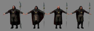
(Thumbnail of course)
It’s been an experience trying to get things together as quickly as possible. How I would ideally like to do it is treat each character completely individually, have fun with the topology, all the unwraps and textures, spend a lot more time dirtying all the clothing and so on. Basically get really involved on every level and push and tweak things around because I find all that quite enjoyable.
The schedule here is much tighter than what I have worked with before both in and out of a studio environment, so I am (gradually) getting used to the mindset of ‘have something that works as soon as possible and progressively refine with the time remaining’. With that in mind, these guardians are getting close to the ‘something that works’ mark in the sense of texturing. There is more to be done – especially the faces with scars, eyes, individuality and so on – but for now I’m moving on to the hair, and fur for the cloaks. Mix of hand painting and photo reference. The skin is all hand painted (though WIP) but I like how that is coming along. Was quite enjoyable seeing as I haven’t hand painted skin textures for a while.
Anyhow, that is where the guardians are at. Much that could be refined or simply added but we’ll see what time permits.
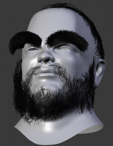
(Edit) A bit of fun here and there is a good thing, so sharing a screencap of eyebrow WIP:
Back to work. 🙂
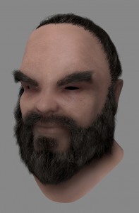
(Edit 2) Hair Progress Render:
Shows up the work needed in the face texture(s), but quite happy with the hair settings for now. Can probably cheat the hair blending in a bit with texture and the darkening of his hood will help the top hair line as well. Saved most of my test renders (15) so will figure out some sort of thing (slideshow or something) that shows the progression. Was worried about hair a bit because it’s been a while since I’ve done any. Getting there!
–Ben


January 19th, 2010 at 8:54 pm
I hope you guys include some timelapse video of your texturing workflow – often there is a blackhole in blender tutorials when it comes to texturing. We get the Blender half, but a good chunk of texturing is often done outside of Blender in Gimp or PS. I’d like to see how you guys accomplish what your doing in other packages too.
January 19th, 2010 at 9:09 pm
Wow good texture & skin material 🙂 keep it up!
January 19th, 2010 at 9:14 pm
Thanks for Update. Really nice color design of clothes. Pants are also animated with cloth simulation?
January 19th, 2010 at 9:14 pm
very awesome!!! i would really like to see a video where you show all the stages of the characters… greetz from Waalwijk, Brabant
January 19th, 2010 at 9:15 pm
Nice work! Maybe make it so they are not all exactly the same height?
January 19th, 2010 at 9:16 pm
This is really some great work! I really like the texturing style. It’s really amazing work!
January 19th, 2010 at 9:27 pm
Whoa! Colors! 😀 At last! It was an awesome moment.
The characters look quite dark compared to the concept; are they going to appear lighter when coupled with the final shader, or are you guys intentionally changing this detail?
I might suggest and encourage slight color and lightness variations between some of the guardians’ cloths or accessories as a way to further individualize them, as this will be a quick first step for doing so.
Anyway. You’re doing a great job, Ben, especially with the limited time. 🙂
January 19th, 2010 at 9:39 pm
Woooooow!
Impressive!
January 19th, 2010 at 9:58 pm
I don´t know why but the second character from left side reminds me of mr. Ballmer a bit 🙂
January 19th, 2010 at 10:17 pm
Fantastic work! Makes me even more curious about the end result!
January 19th, 2010 at 10:47 pm
Great job team!
I suppose it’s temporary, but they got same kind of weapon each, different kind for different personality
http://www.namyang1954.com/Website%20Pictures/weaponsrack.JPG
http://www.shaolin-society.co.uk/weapons/fire.php
http://www.shaolin-society.co.uk/weapons/metal.php
Another thing is to play with size, got an influence on animation and how they would move, but hey, I’m pretty sure what I say is already on the roadmap… 😀
Good luck!
January 19th, 2010 at 10:57 pm
Looking great 🙂 Only thing I would add to it is some sort of protection for their hands. Those staffs look evilly rusty >.
January 19th, 2010 at 11:00 pm
oh.. just found a strange thing. The “lower than” sign breaks the comment. Tracker? :> jk
January 19th, 2010 at 11:08 pm
Nice texturing! The hands kind of jump out at me, though. It may be that the renders don’t focus on them, but at the moment they look like they’ve been routinely manicured and have an odd roundness. It’s all a work in progress, naturally, so I have no doubts about the awesomeness of this work, but I thought I should point it out 🙂
January 19th, 2010 at 11:16 pm
@ Dylan McCall yup. Their hand will certainly have some callosities. Those weapons do not look nice for the skin :> Sintel will kill them before they die from tetanus :>
January 19th, 2010 at 11:18 pm
hi!
are you going to use some script to make the “mesh-hair” into particle hair?
great texturing work!
bye!
January 19th, 2010 at 11:56 pm
Great start on the textures 😀
January 20th, 2010 at 12:22 am
Alots of talk about all this topology, WANT TO SEE!!
January 20th, 2010 at 12:58 am
I like the one with a funky beard.
January 20th, 2010 at 1:18 am
i love the cloaks! they’re really nice.
and Jack still has that weird smile that makes him Jack 😀 cool
GO DURIAN TEAM!!!
January 20th, 2010 at 1:28 am
alas. the characters all look excellent, but the eyes look almost identical across all the characters. I’m not sure how much extra time it would take or whether it would break your auto-rigging system, but it might help the looks a lot if, for example, the beefy guy on the left’s eyes were slightly smaller and closer set, to make him look a little piggier and meaner, and the fu-manchu mustached guy 2nd for the right had a bit of a almond-shaped touch to his eyes, to go with the rest of his Attila the Hun vibe.
January 20th, 2010 at 3:14 am
Those look pretty sweet!! One thing that should be fixed is the hands…on all of them they seem just a tad too big. Other than that, it’s perfect! 😀
January 20th, 2010 at 6:27 am
It look great,but nervous – can 2.50 handle all that Data?
January 20th, 2010 at 7:11 am
Great work Ben!
January 20th, 2010 at 7:18 am
Awesome job Ben! just one thing i noticed, the tree/mushroom things’ (can’t remember what it was) worn and old spots on them are the same on each clasp/spear head. other than that it is perfect!
January 20th, 2010 at 7:38 am
Good work! Should treat characters individually, if time allows!
January 20th, 2010 at 10:13 am
I chilling thought entered my mind when I saw these dudes. Parts of this movie take place in a city unless it is an oddly depopulated city how in the hell are you going to fill it with people. Pixar used something akin to make human called standardman to create its extra’s for the incredible what are planning to do to fill your city because one without any extras will look odd.
January 20th, 2010 at 11:38 am
Hmm. How much time was spent on the models? So far looks rather game-ish.
January 20th, 2010 at 11:45 am
need sharpen weapons
January 20th, 2010 at 12:55 pm
“The schedule here is much tighter than what I have worked with before”
Isn’t it time to ask for help to the community ? 😉
January 20th, 2010 at 1:12 pm
please give the fingers some love. They feel like plastic toys.
No hand in the world is that smooth, there are small “ridges”(sorry english isn’t my native language) at the finger joints and such…
Other than that, lovely characters, they have an icy feeling about them which should suit the setting perfectly
January 20th, 2010 at 3:32 pm
SWEET! The hands do seem a bit on the plastic side, and the cloaks (near the neck line) seem a little “sharp”
textures look amazing! and I want more updates a week! I get bored here at school 😉
January 20th, 2010 at 4:04 pm
I like how Jack needs two belts to hold his pants 😛
January 20th, 2010 at 5:12 pm
Great modeling and texturing job! Also, doing four complete characters in a bit over the time it would take to do one is really impressive work!
I agree with what others have said about the hands being too smooth, but, since they’re out in the snow, wouldn’t they be wearing gloves anyway?
Also, I know everything is meant to be stylised, but I find the cheekbones of the 2nd guard to be quite distracting. They look almost as capable of slicing and dicing as his blade! Perhaps using this reference of Doug Jones would help make them look more believable:
http://www.collider.com/uploads/imageGallery/Doug_Jones/doug_jones.jpg
January 20th, 2010 at 8:38 pm
Yeah, I would also suggest mitten to protect their hands from the blizzard: even if they show good resistance, their weapons seem to be entirely in metal, and thus must act as “cooler” by sucking heat from their hands.
Their mitten could also be weapons, with gauntlet features for destructive punches!
Anyways, congratulation for your work!
January 20th, 2010 at 8:48 pm
Exciting!
Tanks for share Ben.
January 20th, 2010 at 9:03 pm
Hey Ben, awesome job. I’m loving the way this project is going. I know schedule is tight, but hang in there. I think the clothing textures are amazing. I do think the hands could use some better sculpted normal maps or something. Can’t wait to see them lit in an environment. I wanted to ask if you guys would be providing some video commentary / tutorials this time around on UV mapping? I’m a modeler myself, but UV mapping always seems to be such a pain in the butt in every 3d program. I’d like to see a video or two discussing in detail you guys method for unwrapping a human with clothes and such. Your use of multiple UV sets and just your overall workflow you had to develop in order to do these in a speedy fashion. 🙂
January 20th, 2010 at 10:10 pm
Hey Ben, The big bad 4 are looking great!! You and the rest of the Durian team are doing a great job!! I can’t wait to see the finalized models!!
January 20th, 2010 at 10:48 pm
Looks really nice.
But IMHO, it felts strange that they are all exactly the same size.
I think giving them slightly different height would be better, otherwise they may look like a bunch of clones with different disguises.
January 21st, 2010 at 12:39 am
Hello the all “crew” ! 😉
VERY GOOD WORK !! Just three opinions… 🙂
1) the leather middle cross must be more few notches…
2) the leather boot are too clean, too new, they walk in middle of rocks, sharp ice, …
3) the belts are too similar, more inclined…
We are impatient to see more… !! 😉
GOOD WORK !!
January 21st, 2010 at 3:08 am
Those dudes look real good man, awesome stuff 😀
January 21st, 2010 at 7:33 am
Hi, Very great work u doin’ !
First excuse my poor english, im french.
– Yes, it would be great to see a video of you painting the texture. However, it would be better to always post a video, whatever u do, just for us to absorb ur skills.
– The skin tones are very similar, and look like plastic (action man, real doll).
– They are all at the same height
– they got the same smile on the face (for the moment).
– are these guys supposed to use the same weapon ? Maybe some can have a Bow, or a crossbow, another got a sword (or duals), a hammer or a pike, a magic wand, excuze me sir, im a mmo junkee :'(
The guy at the right looks like Mr Incredible !
In the speed of the action we will not see all these similarities but when they are all facing to us, we see them.
They remind me the “Ori” in stargate, some kind of superpowered priest that convert people to their fellowship.
Continue posting !! We like it !
January 21st, 2010 at 9:15 am
It’s nice, very nice. But shouldn’t the guy with the Japanese facial hair be an Asian? I.e. another skin tone.
January 21st, 2010 at 11:11 am
Yeah, you have to tweak the hands and the height of the characters. It’s looking great, though. You have to focus in the enviroment, the scenario, etc… Well done.
January 21st, 2010 at 1:53 pm
out of topic:
Will there be any crowd simulations?
If so, would the application be ported to blender as a core feature? BlenderPeople ( http://www.harkyman.com/blender-people/ ) is brilliant but having to depend on a special build (Blender 2.42a – Character Animation Build) is a bit discouraging.
Unless I have missed the 2.49 port or at least how to animate in the 2.42a special build then transfer the resultant assets to 2.49
January 21st, 2010 at 3:12 pm
Eyebrow WIP!? Why? They are exactly like mine already 😀
Eyebrows are a pain to do… 🙂
January 21st, 2010 at 3:24 pm
Hi all,
I was a bit worried posting at this stage because normally there is a lot more I would like to do to them but schedule wise they are supposed to be finished with all their hair by the end of Friday. Thanks all for the comments, I haven’t had the time to read them all closely but they are quite encouraging. Much appreciated 🙂
To address a couple of quick things I noticed:
City people – most of the shots in the city (without spoiling anything really) take place in the abandoned corners like alleyways and such but there are a few shots planned to show other inhabitants. Nothing to the level of Pixar / ILM / Weta scale crowd sim awesomeness, but a couple of models with Nathan’s autorigging and perhaps some shape key and material tweaks if we need more variants. Basically she isn’t going to bust into the middle of a full town hall meeting with everyone there.
‘Colours darker than the concepts’ – yup, and I have had feedback from our Art Director David about that, the colours currently match the original concepts better. I wasn’t physically present when he was here designing everything so every now and again I slip a bit far from the original design. No biggie, but I’ll try for a bit more consistency seeing as he put the effort into designing a unified look for the story.
The hands and skin – yep, they all have the exact same texture map for faces and hands which is not how they will look in the final film, but to help with visual feedback here at the institute it’s better than having white lambert faces right up until all the individual textures are done. As a general note, the skin is now less saturated and a bit darker, but the hands in particular do need a lot of dirt. Adding dirtyness is pretty easy, just wanted to get the look of skin down first.
Still getting some hair in on the faces and a bit of fur on the outfits, then will have a go at the eyes. Eyes are not too bad to do, but obviously need to get done. But like I said, the ‘official’ budgeted time is until tomorrow at 6pm when Ton gets back from his holidays and does his ‘lets look scary and ask where everyone is up to’ face at the weekly. Anything I want to tweak after that basically comes down to weekends – for the guardians and anything else I wanted to push further. Good times. 🙂
January 21st, 2010 at 3:33 pm
Very nice work !!
It’s looking very good, I’m sure with the animation and the compositing, it will be incredible.
It’s really cool to see the evolution of the movie, you still find time to make cool blog post with this huge amount of work.
Durian production is as epic as the film !
January 21st, 2010 at 6:20 pm
Nice! 😀
January 21st, 2010 at 6:23 pm
edit2 is wonderful ! i’m looking forward to seeing more like this !!
he maybe needs a little more headhair…
typically guys with that bushy eyebrows and beard have son more headhair I i’d say..
but at all very good work ben – nice hair colours
January 21st, 2010 at 6:51 pm
The hair and skin have really come together! 😀 But yes, the forehead texture needs revision. More lines, more lines! 🙂
But is that hair on his head going to be final? :O I loved and was really looking forward to his long Grima hair. I thought it was so cool. 😛
January 21st, 2010 at 7:03 pm
About his head hair – still not sure rigging / sim wise how to do hair underneath a hood. If everything works, then he will have his long hair hanging out from underneath his hood like the concept. For the moment though, the head hair fits into the ‘something that works then refine’ category so it will tuck under the hood. But generally if something is in the concept art the aim is to try and make it work. 🙂
January 21st, 2010 at 8:06 pm
The images with hair are awesome!
Please next time post with some eyeballs, even fake ones are ok. The last pic is really weird without the eyeballs.
January 21st, 2010 at 7:14 pm
Hello, everybody ! 😉
VERY GOOD WIHT THE HAIRS… !!!
And with several scars will be better…. !!
Like : Captain Harlock…
http://www.boolsite.net/images/wallpapers/DessinsAnimes/Albator/Albator08.html
Salut Neoranga, cela sert d’être français…. ;-), “raleur” mais au moins ça fait avancer le “schmilblik” dans le bon sens pour les esprits positifs… !! 😉
A+
GOOD WORK to ALL !!
January 21st, 2010 at 9:06 pm
about same weapons clothes:
The word guardian make it sound like they would be in the position to use uniforms and be organized. I think it’s very logical that they carry the same equipment.
Nice hair!
January 21st, 2010 at 9:29 pm
I think the characters are good(not study them), but isn’t the beard too perfect shaved/shaped? To get more realistic feeling try to investigate the smoothness of a beard. The mustache is looking quite realistic, but under the lips it’s too well shaved/shaped, I think. From my own experience it’s thinner up on the chin(towards the eye), more “noisy”/rough? under the lips. The hair on the head and on the temples(didn’t found the word for that…) seems to be misplaced, I think it should be closer to the face. Maybe the ear to, because something looks incorrect…
January 21st, 2010 at 9:20 pm
Hi Ben,
looking good so far.
Maybe a little advice for the beard(though a have to admit that i never worked with blenders hair tools so far):
It often is good pratice to make 2 Hairsystems for the Mustache (left and right), because otherwise the hairs under the nose will interpolate between the guide curves and you never get them aligned to the left and to the right. Also the hairs in the middle tend to be shorter than the rest if you use only one hairsystem.
The rest of the beard should work fine with one hairsystem.
Cheers, Ruben
January 22nd, 2010 at 10:28 am
Hey, nice Work,
iam really looking forward to the durian main characters, they all are so detailed by now ^^ And of course iam a big fan of Jack Super Brow^^
But i would also make the beard below the lips more fuzzy, but lets see what it will look like when its done 😉
Keep on the good Work!
greetings
chubaso
January 22nd, 2010 at 11:45 am
Hey! amazing pics! I’m specially impressed with your skin work Ben!!
I hope some examples/time lapses could be released for the community to learn of your knowledge! (or just added to the extra material of the DVD!)
Thanks for working so hard!
January 22nd, 2010 at 2:41 pm
go durian-team make it work !!
you’ll make it – i’m sure !! 🙂
i’d love it when you could make the hair react on objects
like the clothes
that would be awesome for blender 🙂
sry for my bad english^^
January 22nd, 2010 at 3:41 pm
That hair is looking pretty sweet, actually, dude looks like a toffee that got lost under a couch for a few weeks (that’s a compliment :P)
Great stuff, Ben.
January 22nd, 2010 at 3:42 pm
Dude looks a lot like Gimli, Son of Gloin 😉
January 22nd, 2010 at 3:53 pm
Actually, I think he looks like Peter Jackson as the Corsair in Return of the King. 😛
http://www.wetanz.com/peter-jackson-as-a-corsair/
January 26th, 2010 at 2:40 pm
would be great if you could post the .blend files even if they aren’t finished. :p
January 27th, 2010 at 6:09 pm
You know, he has a cute little nose XD
May 23rd, 2010 at 3:12 am
I just realized that we should use Nathan as a guardian!